The first thing you see is the title, its in two different sizes to possibly show the importance of different words, its also two different colours, pink and white, which make a big difference to the page and make it look a lot more interesting, the two colours also really stand out on the grey background of the page so it catches your attention. The title is also a question, which means that the answer will be somewhere in the text making you read the whole thing just to find out the answer. The piece of text below the title briefly explains what the article is about and highlights words such as names important words to the article, they are also written in pink which stands out more than the other text.
The picture is very fitting to the article as it matches the colour scheme and is very simple, it takes up a whole page and is very easy to see, it also catches your attention as he is looking straight ahead making eye contact with the reader making the reader more engaged and feel that the article is specifically aimed at them.
The text on the article has been written in a very simple but clever and effective way, the questions being asked are highlighted so that the reader can know exactly where they are and what is being asked straight away, as they are easily visible and can draw your attention straight away. There is a drop cap in the first paragraph to show the reader where the main bit article starts and to show that part is important to the entire article. The writing page also has a border around it made up of bright white circles, these could be used to attract attention to the page and is also clearly there to act as a border indicating that the article and main focus are inside of it.
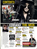
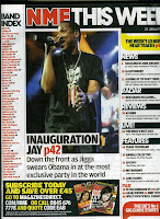
Layout - usually set out in 3 or 4 columns that is structured and flows well across the page with lines or images separating each part
One main image - relating to the main article of the magazine that catches your eye first
Top of the page - logo, name of the magazine that usually stands out, issue date and the word 'Contents'
Colours - usually follows the same colour scheme and house style as the front cover
Photography - main image related to the front cover and main feature with smaller images related to other articles
Page numbers - that aren't in chronological order relating to the content of the magazine
Pug/starburst - with subscription information about getting the magazine regulary