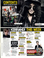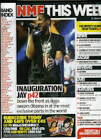

When making a contents page there are many key conventions that need to be taken into consideration. Below are some images of contents pages of existing music magazines, I will use these to help me when it comes to creating my own. I will be mainly concentrating on contents pages from popular music magazines as these attract the most people to buy the magazine
These examples of contents pages are all from popular music magazines but are very different. Magazines such as Vibe and MOJO are very image dominated, with very small amounts of text were as magazines such as NME and Kerrang include more text but still do however have a lot of images, In my opinion these look very cluttered and scruffy, making them harder to read. Vibes contents pages on the other hand are very clear and look a lot more professional, as well as this, it also only has one image which stands out very clearly, this is showing the importance of the person and makes them out to be the main focus of the magazine
No comments:
Post a Comment