Layout - usually set out in 3 or 4 columns that is structured and flows well across the page with lines or images separating each part
One main image - relating to the main article of the magazine that catches your eye first
Top of the page - logo, name of the magazine that usually stands out, issue date and the word 'Contents'
Colours - usually follows the same colour scheme and house style as the front cover
Photography - main image related to the front cover and main feature with smaller images related to other articles
Page numbers - that aren't in chronological order relating to the content of the magazine
Pug/starburst - with subscription information about getting the magazine regulary
Saturday, 22 February 2014
Tuesday, 11 February 2014
Contents page research


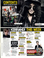
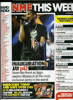
When making a contents page there are many key conventions that need to be taken into consideration. Below are some images of contents pages of existing music magazines, I will use these to help me when it comes to creating my own. I will be mainly concentrating on contents pages from popular music magazines as these attract the most people to buy the magazine
These examples of contents pages are all from popular music magazines but are very different. Magazines such as Vibe and MOJO are very image dominated, with very small amounts of text were as magazines such as NME and Kerrang include more text but still do however have a lot of images, In my opinion these look very cluttered and scruffy, making them harder to read. Vibes contents pages on the other hand are very clear and look a lot more professional, as well as this, it also only has one image which stands out very clearly, this is showing the importance of the person and makes them out to be the main focus of the magazine
Monday, 3 February 2014
Subscribe to:
Comments (Atom)
